There is nothing better than having a bit of whitespace for your content to breathe. It gives your design a more cohesive look. White space is not merely the space left between the lines of text but also the segment of the page that is left untouched, as well as the area between the elements of the design and the area between the graphics. This small space gives the design a chance to stand out in a fresh and attractive way. Furthermore, it creates visual balance in your design.
Whitespace plays a crucial role in allowing a design to be transformed. When you have a good design on your website, you are putting your best foot forward. Nobody likes browsing a site that is cluttered up.
As designers, it is always important to focus on creating a layout that is appealing to the eyes and keeps your user interested in reading the content. Whenever you deliver a good website design, you should make sure that it meets the expectations of your clients as well as the users. Some web designers avoid the use of spaces, and these designers are aware of how this will result in cluttered pages, creating difficulties in reading the contents and making it hard for visitors to distinguish between elements.
Therefore, it is strongly recommended that you use white space in your design whenever possible.
Our goal today is to learn about the importance of whitespace in your design. There are many little things you can do that will significantly impact the look of your design.
Let us have a look at the types of whitespace;
TYPES OF WHITESPACE:
In the first place, there is not only one type of white space, but there are a number of different types to choose from. They can be categorized on the basis of the density with which they are distributed.
They are called micro-white spaces, and they are the spaces you can see between letters, paragraphs, and small elements like line breaks, buttons, and arrows. The next set is macro white spaces. They are a little bigger in size than the previous ones. It is the space between graphics elements, margins, and columns of text that constitutes these spaces.
Additionally, there are two other types of white spaces, which are passive spaces and active spaces. A space separating the elements may seem small and casual, but it plays a significant role in creating a perfect design.
A space between small elements doesn't only play a passive role, but it is also purposely adjusted by the designer to create a user-friendly design that the user can access; the space is used to organize text, icons, and paragraphs.
The active space in the design is not something special but serves to emphasize the most important elements in the design. This concept is the same as macro space since it is about giving importance to a specific area and emphasizing it.
There are many reasons why whitespace is one of the most powerful tools that can be used in our design.
Let us look at some advantages of whitespace.
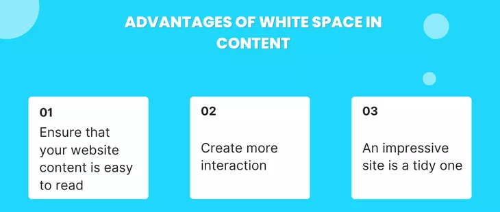
ADVANTAGES OF WHITESPACE IN CONTENT:
- Advantages of Whitespace in Content: When someone visits your website, they should be able to read and understand what they are going
through. If your website has a lot of whitespaces, your users may be able to read and enjoy your content. As an online viewer, you will need enough visual breathing space to understand what you are reading and determine if it is attractive to you. You can make your site more attractive and interesting by incorporating whitespace in small elements like between the lines, paragraphs, and around the images. - Create more interaction: As we all know, everyone is busy with their own world, and they don't have much time to spend on browsing; they certainly want to do it quickly, and if it utilizes whitespace efficiently, it might work in your favor. Visitors are more likely to stick around if the site has fewer clusters and large images or content. Adding just a small amount of padding around elements will make them more inviting. The key to making everything look big and attractive on your website is to use the whitespace to your benefit.
- An impressive site is a tidy one: when you see your room is cluttered and messy, you are just using it more because a tidy room infuses the room with a sense of freshness and life. The same goes for a site when it comes to its design of it. The first thing that a visitor should notice as soon as they arrive on your website is the welcoming attitude, as the first impression would matter quite a lot to even the visitors. White space not only creates a perfect harmony on the page but also adds to the brand identity on the webpage. It is creating a layout that does not overcrowd the screen but still delivers content that is clear and balanced.
In case you are looking for content resource management firms that can help you figure out how to optimize and manage your content adequately, visit: www.webcube.ca. In case you have any questions or queries, feel free to contact us via mail at contact@webcube.ca or call us at 780.655.2210.

